Using Colors: My Best Techniques
Colors In An Outfit
Colors in an outfit can be tricky, am I right? Well it doesn’t have to be if you know the right techniques. Keep reading to find out what techniques I like to use and how you can use them yourself.
One Print, Many Colors
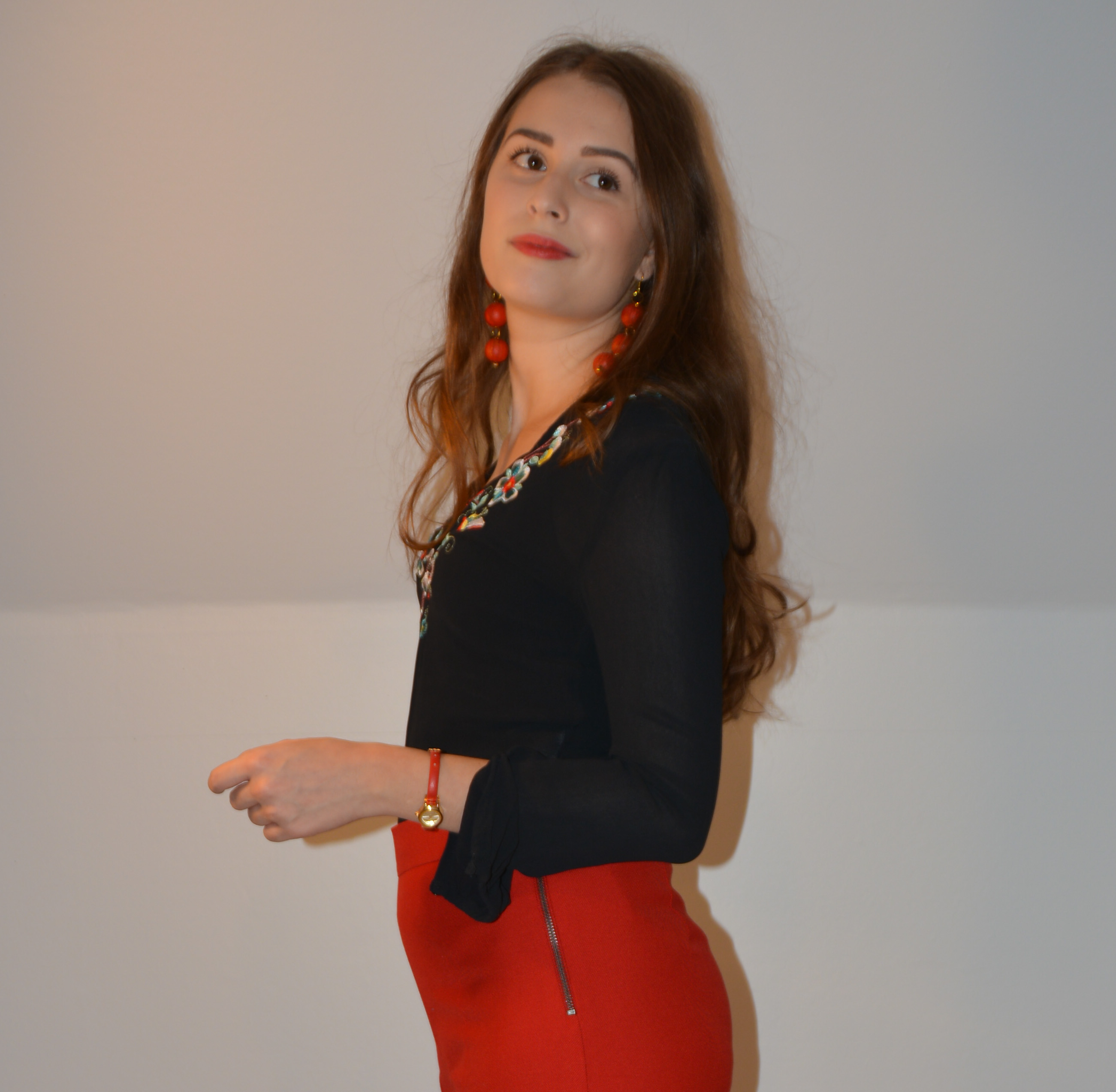
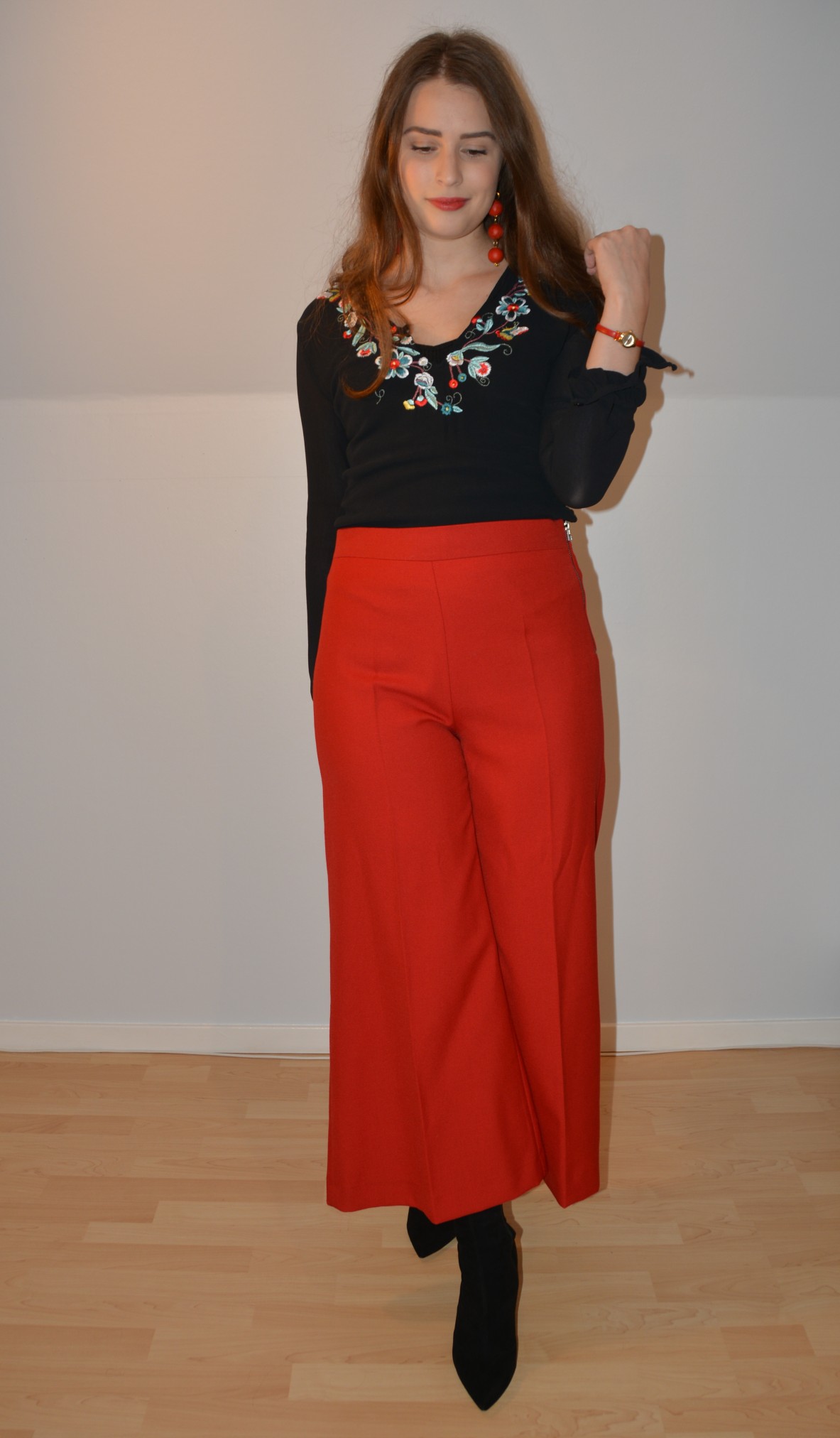
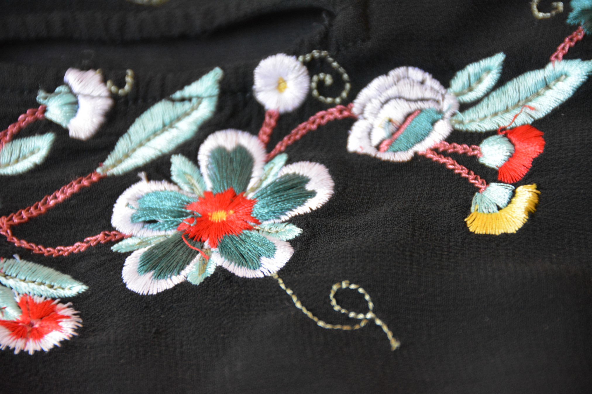
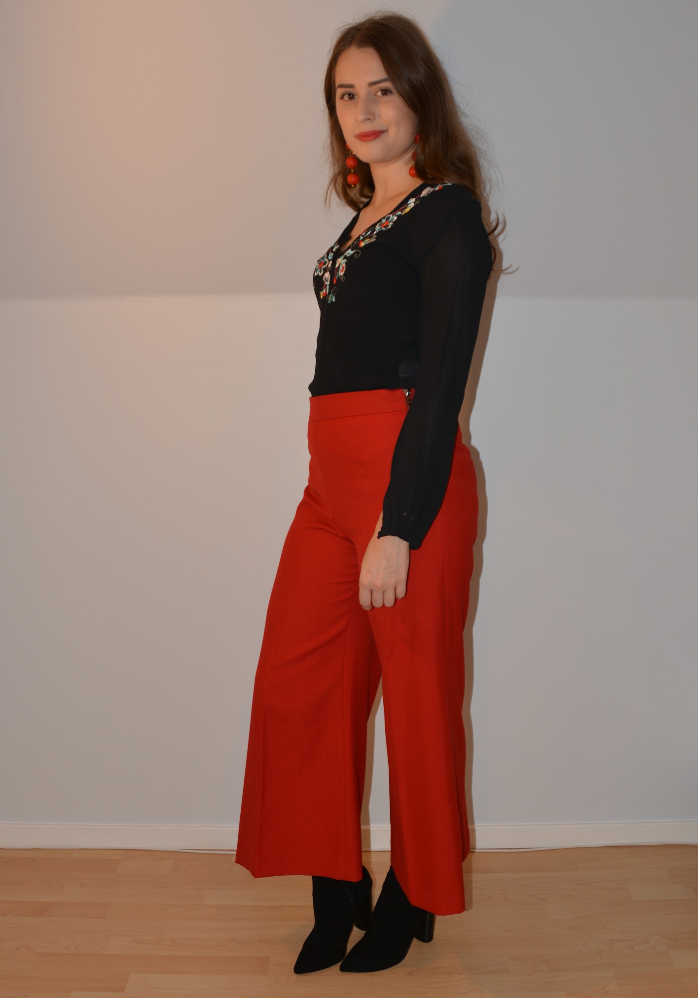
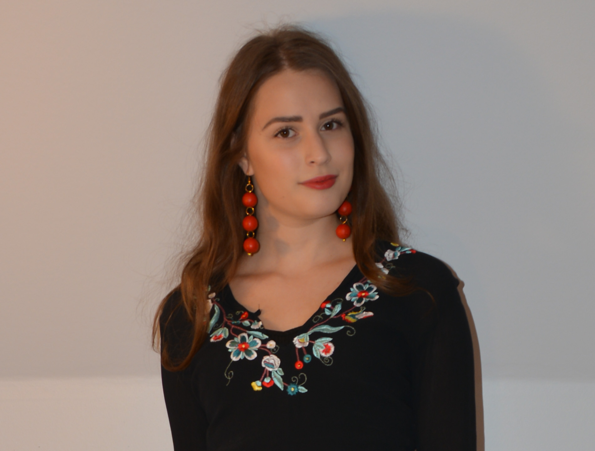
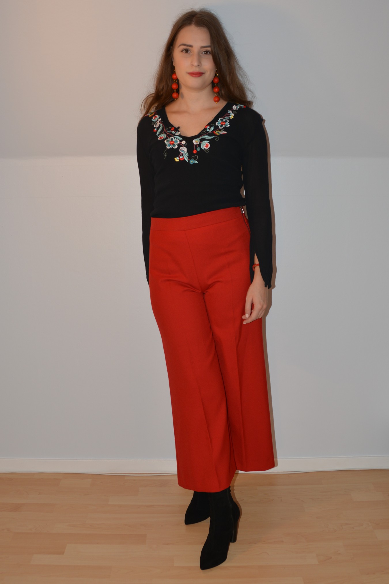
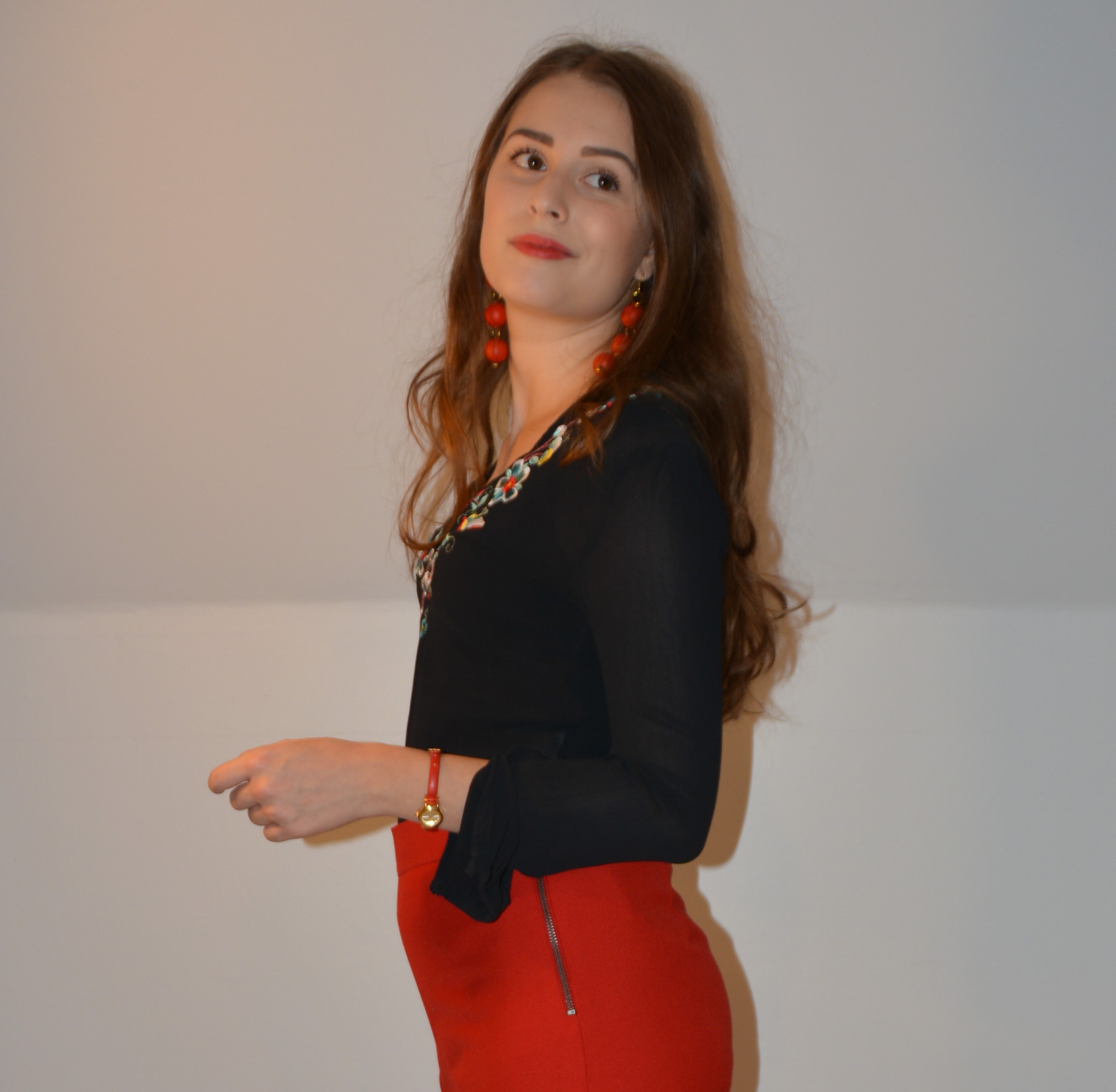
The easiest way to use more than one color in an outfit would be to choose an item with a print; or in my case a floral embroidery blouse. My floral embroidery has mainly light turquoise and teal in it, but there is also some red, yellow, white and a little pink going on. I chose to use the red in the embroidery because out of all these colors I own mostly red items.
- The teal and the light turquoise is the most prominent colors in the embroidery, so one of them would be the most obvious choice, but obvious can sometimes turn in to boring. To avoid this I would finish off the outfit with another color; for example by adding a red bag. If I were to add another color to my outfit I would choose yellow because it comes after red on the “most prominent list” (on this blouse.)
- I mentioned the white in the embroidery before but because that’s not considered a color in this case I did not count that in. The pink is the least prominent one because from afar it looks red. Matching this blouse with the right shade of pink would look right up close, but as a whole the outfit would not make sense. This always make me frustrated when I find the perfect shade to match but it’s not visible from afar.
Two Colors & One Connecting Piece
My second technique is choose two pieces with different colors; let me give you an example:
Let’s say we have a blouse in a medium purple shade with a hint of pink. To go with the blouse we have a bright teal mini skirt. These two colors don’t neccessarily clash but they don’t really match perfectly either. Then let’s say we add a printed waist belt with these two colors as the most prominent ones (let’s add some light turquoise and black to it as well). This way the colors have something connecting them. To avoid it being to matchy matchy we can add a pair of black shoes. To make this outfit less obvious let’s choose gold jewelry because without the shine gold is just a shade of yellow. So in the end we have now added another color in a more discreet way but this takes the outfit to another level.
Colors Without Prints
This final technique is perfect if you don’t like prints or if you don’t own any pieces to go with them. To use this technique you’ll need two pieces in matching colors; with other words colors close to each other. Here are some examples:
- Blue and purple/green/anything in between.
- Red and pink/orange/anything in between
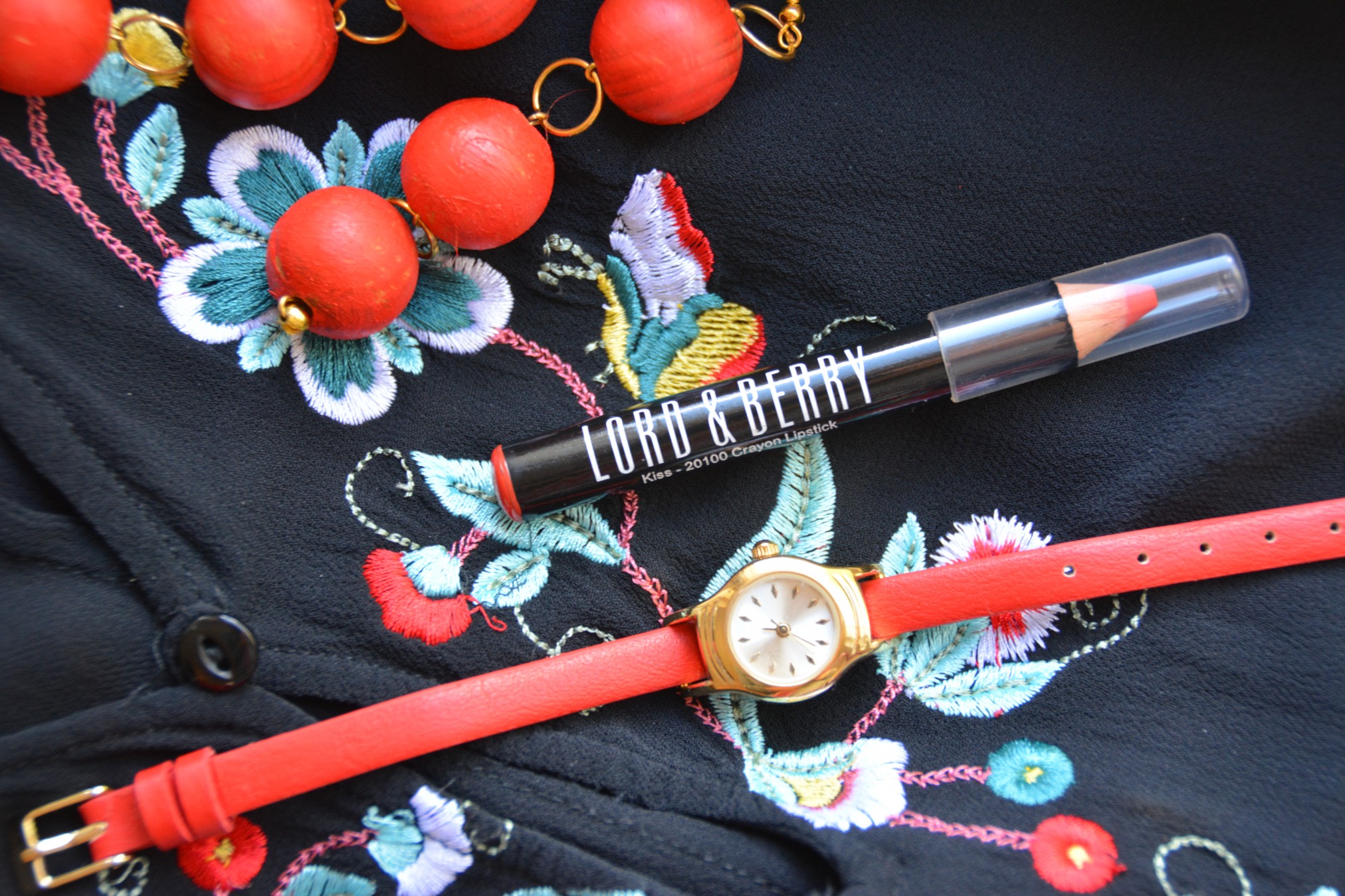
To finish this outfit I would match the shoes, bag and jewelry. Another option is for one of them to be in a color (either a contrasting one or a matching one.)
If you like my earrings you can check out the DIY post here, for more outfits click here or check out my Polyvore sets.
Thanks For Reading
Do you have any questions? Feel free to ask me in the comment section below. If you liked this post please don’t forget to click the like button below. To receive an email when I publish something new; subscribe to my email list by clicking the follow button below (or click subscribe in the menu underneath the header.) If you’d like you can also use the buttons below to share this post.
3 Replies to “Using Colors: My Best Techniques”
Så otroligt snyggt❤️❤️❤️!
Snyggt! Har du broderat blommorna?
Tack! Nej det har jag inte, men tack för komplimangen!